

The Poverty Rate in SFUSD, part 2
How does the distribution of poor students at SFUSD schools compare with other districts? And does it matter?
Comparison of SFUSD and Other Districts
About half of SFUSD’s students are eligible for free and reduced-price meals (“FRPM-eligible”). We saw in the last post that at some SFUSD schools fewer than 20% of students are FRPM-eligible while at others it’s over 80%. How unusual is it to see such a range? Let’s compare SFUSD to all California school districts with at least 10 elementary schools.
The following graph shows the standard deviation and median school FRPM-eligibility rate for each district. The graph looks a bit like an inverse “U” because, in order to have a high standard deviation, a district needs some schools with far more FRPM students than the district average and some other schools with far fewer FRPM students than the district average. That means it must have significant numbers of both FRPM-eligible and non-eligible students. The districts with low standard deviations either have very low or very high overall FRPM-eligibility rates (in other words, it’s rare to find a high poverty school in a low poverty district or a low poverty school in a high poverty district).

We can see that the distribution of FRPM-eligible students in San Francisco schools is not unusual. The standard deviation of the distribution is about 23%, in line with a bunch of other districts that have similar overall percentages of FRPM-eligible students. You may notice there is a group of five districts whose median schools are 50-60% FRPM but whose standard deviations are under 15%. These are all much smaller districts: if I’d set the threshold at 15 schools instead of 10, they wouldn’t be shown at all.
I’ve used color to highlight the positions of San Francisco and several other notable school districts:
Berkeley, the model for the proposed new elementary school assignment system. It has used a zoned enrollment system since the 1990s. Berkeley is comparatively small. It has 11 elementary schools, divided into 3 zones. One zone has three schools, one four, and one five. One school is a district-wide Spanish immersion school and two schools span two zones. In 2019-20, 26% of elementary school students were FRPM eligible and the percentage at each school ranged from 18.6% to 30.4%. The Spanish immersion school was 52% Latino compared with a district average of 22%.
Long Beach, in LA County, is used by SFUSD as an internal performance benchmark. It is a large urban district that is majority Latino and has a much higher percentage of FRPM-eligible students (68% in 2019-20) than SFUSD. It is a good benchmark because most student groups, and Latino students in particular, do much better in Long Beach than they do in San Francisco.
ABC Unified, also in LA County, is the only district in the state where every subgroup (e.g. Socially Disadvantaged African Americans, Non socially disadvantaged Latinos etc.) does better than the state average in both ELA and Math. It has about 20,000 students of whom nearly 45% are Latino and 24% are Asian. Its FRPM-eligibility rate is 50%, the same as SFUSD’s.
Clovis Unified (near Fresno) is notable because its achievement gap is so small (i.e. the difference between the percentage of White students who meet or exceed standards and the percentage of Black students who meet or exceed standards). It has over 44,000 students and a 44% FRPM-eligibility rate (both numbers a bit smaller than SFUSD).
If you open the associated tableau page, you can click on each district and see the exact distribution of FRPM-eligibility in its schools. For those disinclined to do that, here is a histogram of the distribution of FRPM-eligible students for elementary and K-8 schools each of those districts. First, SFUSD, which has a bimodal distribution with a bunch of schools (primarily on the westside of the city) that are fewer than 35% FRPM-eligible and bunch (primarily on the Eastside) that are more than 70% FRPM-eligible.

Here is the same histogram for Berkeley. It is obviously a much tighter distribution.

Here is the distribution for Long Beach. Even though 68% of Long Beach’s elementary school students are FPRM-eligible, it has schools where that percentage is as low as 15% (irony alert: the school with the lowest percentage is called Lowell Elementary). This skewed distribution means that the median school is 81% FRPM-eligible. By contrast, in San Francisco the median school (52% FRPM-eligible) is very close to the overall average (50%).

Here’s the distribution for ABC Unified. It’s also skewed to the right but not as dramatically. The median school is 58% FRPM-eligible even though the district is 50% FRPM-eligible.

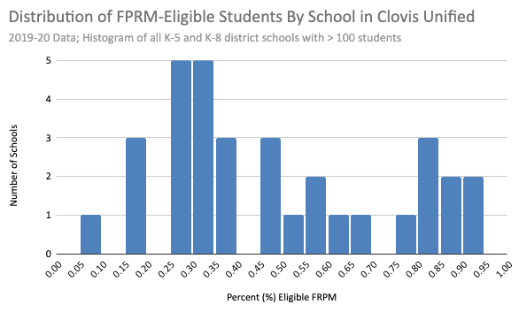
Finally, here is the distribution for Clovis. The distribution is particularly wide (one school is fewer than 10% FRPM eligible and two are more than 90% FRPM-eligible). Unlike Long Beach and ABC, here the distribution skews a bit to the left: the median school (40% FRPM-eligible) is lower than the district student average (46% eligible).
What have we learned?
The range of FRPM-eligibility rates across San Francisco’s schools is not unusual. Some of the highest performing districts in the state have distributions as uneven or more uneven than San Francisco’s.
Berkeley stands out as having a very even distribution. They set out to assign children to schools in a way that attempts to equalize the poverty rate across schools and they succeeded. There’s no district in the state that comes close.
Does this matter? What effect, if any, has it had on student achievement?
Student Achievement
Let’s start by comparing Berkeley and San Francisco. 2018-19 is the last year for which we have SBAC scores. In that year, White, Black, and Latino children did better in Berkeley than in San Francisco while Asian students did worse in Berkeley than in San Francisco. This is true even after controlling for SFUSD’s higher levels of socioeconomic disadvantage. Ideally, we’d control for San Francisco’s higher proportion of English-learners but that data is not publicly available.
However, while most student groups do better in Berkeley, the much-talked-about achievement gap1 is no smaller. Let’s focus just on socioeconomically disadvantaged (SED) kids. The White-Black achievement gap is bigger among SED kids in Berkeley than in San Francisco and the Asian-Black gap is smaller in Berkeley than in San Francisco. I’d caution against reading too much into this apparent anomaly because it may just be an artifact of small numbers (only 152 SED Asian and 182 SED White kids took SBAC tests in Berkeley in 2018-19).
To make this clearer, here’s a graph showing the performance of socioeconomically disadvantaged students in San Francisco and Berkeley alongside those in Long Beach, ABC, and Clovis.

SED Latino and Black students do much better in each of Long Beach, ABC, and Clovis than they do in San Francisco or Berkeley even though the schools in those districts have distributions of FRPM-eligible students that are even more uneven than San Francisco’s.
Conclusion
Attempting to equalize FRPM eligibility rates is neither necessary nor sufficient for student success. It is not necessary because the best performing districts in the state don’t attempt it. It is not sufficient because the district that has done it, Berkeley, has an achievement gap comparable to San Francisco’s.
Of course, it’s possible that Berkeley’s performance would be worse if it had neighborhood schools. It’s possible that Long Beach, ABC, and Clovis would be even better if they moved away from neighborhood schools. More likely is that the reason Long Beach and ABC and Clovis and others get such good results is because they focus on the basic job of teaching students and are not distracted by trying to socially engineer the ideal student composition at each school.
I’m referring to the achievement gap because it’s the metric that people always reach for but I dislike using it because it doesn’t measure what people think it measures. If you’re comparing the performance of groups A and B in districts 1 and 2 as a way of evaluating the districts’ performance you are implicitly assuming that group A in district 1 is the same as group A in district 2. But if district 1’s group A has richer, more educated parents and speaks fluent English it’ll do better than the district 2’s group A which will distort whatever point you’re trying to make about the gap between A and B. For example, SFUSD’s White population is much richer and better educated than White populations in other districts while its Asian population is poorer and less fluent in English than Asian populations elsewhere. Any “achievement gap” analysis that doesn’t adjust for this is misleading.