Math Vision Based on Fuzzy Math
Treat the numbers in the Math Vision presentation with skepticism
Tomorrow’s board meeting promises to be a humdinger. One of the topics on the agenda is the “Math Vision Presentation”. I was heartened to see that it includes the commitment to bring back Algebra in middle school in some yet-to-be-determined way.
The presentation stresses the importance of high-quality instruction and uses the following two charts:


These effects seemed very large, almost implausibly so. I was particularly struck by the idea that teacher expectations could be the strongest factor. I had no problem believing that that higher expectations could be a positive factor but couldn’t imagine the mechanism by which higher expectations work if not by providing stronger instruction, including giving more challenging assignments to students who are more engaged in class.
The source for these charts is this report produced by TNTP, an education nonprofit formerly known as The New Teacher Project. To understand the numbers better, I also read the associated technical annex closely. The debate about the California Math Framework has demonstrated the importance of verifying that external studies are being interpreted correctly and that those studies are high quality and not based on very small samples.
Process
TNTP partnered with five school systems: three large urban districts, one small rural district, and a charter management organization (CMO). For each of the three urban districts they chose six schools: two elementary, two middle, and two high. They chose one higher-achieving and one lower-achieving school in each grade level. For the rural district and the CMO, they just had one school per grade level. At each school, they attempted to enlist 10 teachers and those teachers then chose two classes to participate in the study. In each classroom, teachers chose six students to collect work from and then photographed all their work in three separate weeks during the school year, one week in the fall, one week in winter, and one week in the spring. Each assignment was rated by a research-term member for assignment quality (e.g. does it align with grade-level standards) and student performance.
The researchers also observed at least two full lessons in nearly all participating classrooms and rated the content of each lesson. Students were surveyed during class to measure their engagement with the lesson. Older kids also filled out one-time background surveys about career aspirations. Teachers also completed a one-time survey that asked, among other things, about support for state standards and expectations for student success against the standards.
I’ve described the process in some detail so that you can appreciate the strengths and weaknesses of its design. Unlike most studies, it looked at what happens inside the classroom, instead of just observing inputs and outputs and treating what happens in the classroom as a black box. But, although it looked at a diverse range of classes and districts, it does not claim to be statistically representative (“we did not seek to construct a nationally representative sample”).
A few random tidbits from the statistical annex:
Among the five school systems, the CMO had the highest proportion of assignments that were deemed grade appropriate, the second highest percent of lessons with “strong instruction”, by far the highest expectations for student success and support for standards. But it had the lowest student engagement scores. [Table A.12]
Whereas math and ELA classes tended to have better assignments (i.e. assignments that are more reflective of what students were supposed to be learning) and receive better instruction scores, students tended to be more engaged in science and social studies [Page 25 and Table A.14]. The comparative weakness of the assignments and instruction in science and social studies was one of the statistically strongest results in the report.
Advanced and non-advanced courses received similar scores, but remedial courses tended to receive lower-rated assignments, lessons, and had teachers with lower expectations. Students in remedial courses did tend to, however, have higher levels of engagement. [Page 25]
Teachers with at least 10 years of teaching experience tended to have better-rated assignments, instruction, and higher expectations. However, students were more engaged in classrooms with a teacher in their first five years.
Students’ free-reduced lunch (FRL) eligibility was consistently associated with lower ratings for assignment quality, instruction quality, student engagement, and teacher expectations. “Classrooms with more students of color also tended to have lower ratings on assignments and instruction, as well as lower engagement, but these associations mostly disappeared, or in some cases became positive when we controlled for FRL status as well” [page 25]
Quantifying the Effects
The researchers wanted to calculate if the different classroom metrics they had observed (i.e. assignment quality, instruction quality etc.) were associated with better performance on state tests. To do that, they constructed a model that predicted how students would do on those tests given their demographics and prior achievement and then subtracted the predicted score from the actual score to estimate how much better or worse than expected each student had done. The estimates were then averaged by classroom to produce an estimate of “value-added” (i.e. extra learning per student) for each classroom. Since the districts were in different states and used different standardized tests, all the results were expressed in standard deviation units. This is a common approach to trying to make effect sizes comparable.
Unfortunately, most states only do standardized tests in Math and ELA and only in certain grades. So most of the high school and early elementary classrooms that had been studied had to be excluded, as did the science and social science classes. The classrooms in the CMO and the small rural district also had to be excluded for other reasons. Although the study covered 456 classrooms [Table A.1, page 2], the number of classrooms for which they could calculate the value-added numbers was “near 70” [page 37] i.e. only about 15% of the participating classrooms.
They then divided these “near 70” classrooms into quartiles by score on each of the classroom measures. To calculate the effect of each metric, they compared the quartile of classrooms with the highest scores for that metric with the quartile that had the lowest scores for that metric. The results are shown in Table A.21 below, with the key numbers circled in red.

The way to interpret this is that the quartile of classrooms with the highest quality assignments scored 0.05 standard deviations higher than the quartile with the lowest quality assignments while the quartile with the highest teacher expectations scored 0.13 standard deviations higher than the quartile with the lowest teacher expectations. The bar chart I showed at the beginning is based on this data but with standard deviations converted into months of learning by assuming that one year of learning is equivalent to 0.25 standard deviations1 and that there are nine months in the year. So the number for assignments (0.05) becomes 0.05 * 9 / 0.25 = 1.8 months of learning and the number for expectations (0.13) becomes 0.13 * 9 / 0.25 = 4.7 months of learning. (The bar chart showed 1.7 and 4.6 instead of 1.8 and 4.7, presumably because of rounding).
They then isolated all the classrooms that began the year with “an average prior achievement score of 0.5 standard deviations below the state average - or lower – the rough equivalent of starting at least two years behind the state”. There were only “near 20” such classrooms, a number so small that they decided not to divide them into quartiles for analysis but into halves. The second bar chart above is based on the results circled in blue. Among the classrooms that started off substantially below the state average, the ten or so that had the highest quality assignments scored 0.20 standard deviations higher than the ten or so with the lowest quality assignments.
Now let’s look at the numbers circled in green in the bottom portion of the table, which is for classrooms whose prior achievement was substantially above the state average. They don’t say how many classrooms fit into this category so it must be very small. The instruction score of -0.21 means that, among the classrooms that started out substantially better than the state average, the half that had the best instruction scored 0.21 standard deviations worse than the half that had the worse instruction. Either they’ve hit on a dramatic new discovery (“high-achieving students do better with bad teaching”) or their measurement of instruction quality doesn’t accurately measure instruction quality or we’re just seeing a statistical anomaly due to tiny sample sizes. It’s easy to see why they didn’t do a bar chart for this.
You’ll notice that a few of the numbers in the table, and only a few, have asterisks next to them. *, **, and *** represent values significantly different from zero at the 0.05, 0.01, and 0.001 levels respectively. In other words, virtually all the numbers we’ve talked about here, and that TNTP showed in the bar chart, could be statistical noise. The single asterisk next to the Expectations number means that we can have 95% confidence that teachers’ expectations have a non-zero effect (which is not at all the same as 95% confidence that the effect size is 0.13 standard deviations).
It shouldn’t be surprising that the results have no statistical significance. When the total sample size is about 70 classrooms, each quartile is about 17 classrooms which is about the size of one elementary school. Comparing the top and bottom quartiles is thus like comparing the results of two elementary schools. We shouldn’t expect to be able to conclude anything definitive with such a small sample size.
My suspicion is that the whole idea of doing a value-added analysis to see if better assignments / instruction / engagement / expectations led to increased learning was not part of original study proposal at all. If it had been the plan from the beginning, they would have restricted their original choice of classrooms to ones for which they could obtain the necessary assessment data. If they had had 450 classrooms worth of data instead of just 70, they might have been able to produced statistically sound numbers. As it is, the numbers on the bar charts are statistically unreliable and the cautionary words “in our sample” that precede them are doing a lot of work.
Strong Instruction vs Weak Instruction
That’s not the only example of overstating the evidence that I found. Consider this graphic which can be found on page 39 of the report.

Recall that observers tried to sit in on two lessons of every class that was participating in the study. The observers rated each lesson using a 4-point rating (0 = Not Yet; 1 = Somewhat; 2 = Mostly; 3 = Yes) for each of the following domains: (see Technical Annex, page 9)
Culture of Learning: Are all students engaged in the work of the lesson from start to finish? Do they follow behavioral expectations?
Content: Does the content of the lesson reflect the key instructional shifts required by college and career ready standards?
Instructional Practices: Does the teacher employ instructional practices that allow all students to learn the content of the lesson?
Student Ownership: Are students responsible for doing the thinking in the classroom?
The evaluation rubrics are here. I’m not qualified to determine what is and is not strong instruction but it seems to me that the rubrics insist on a particular style of teaching, one in which student work is discussed openly during class. Plenty of lessons deemed to have weak instruction had teachers covering grade-level material and students behaving well. It was Instructional Practices and Student Ownership that led many of them to be rated as Weak. 87% of Strong lessons but only 3% of Weak ones scored at least a “Mostly” on Instructional Practices. 64% of Strong lessons but only 1% of Weak ones scored at least a “Mostly” on Student Ownership. (see Technical Annex, Table A.5)
For now, let’s assume that what the raters classified as Strong Instruction really is strong instruction. The numbers circled in blue below show how the five participating districts scored on instruction quality.
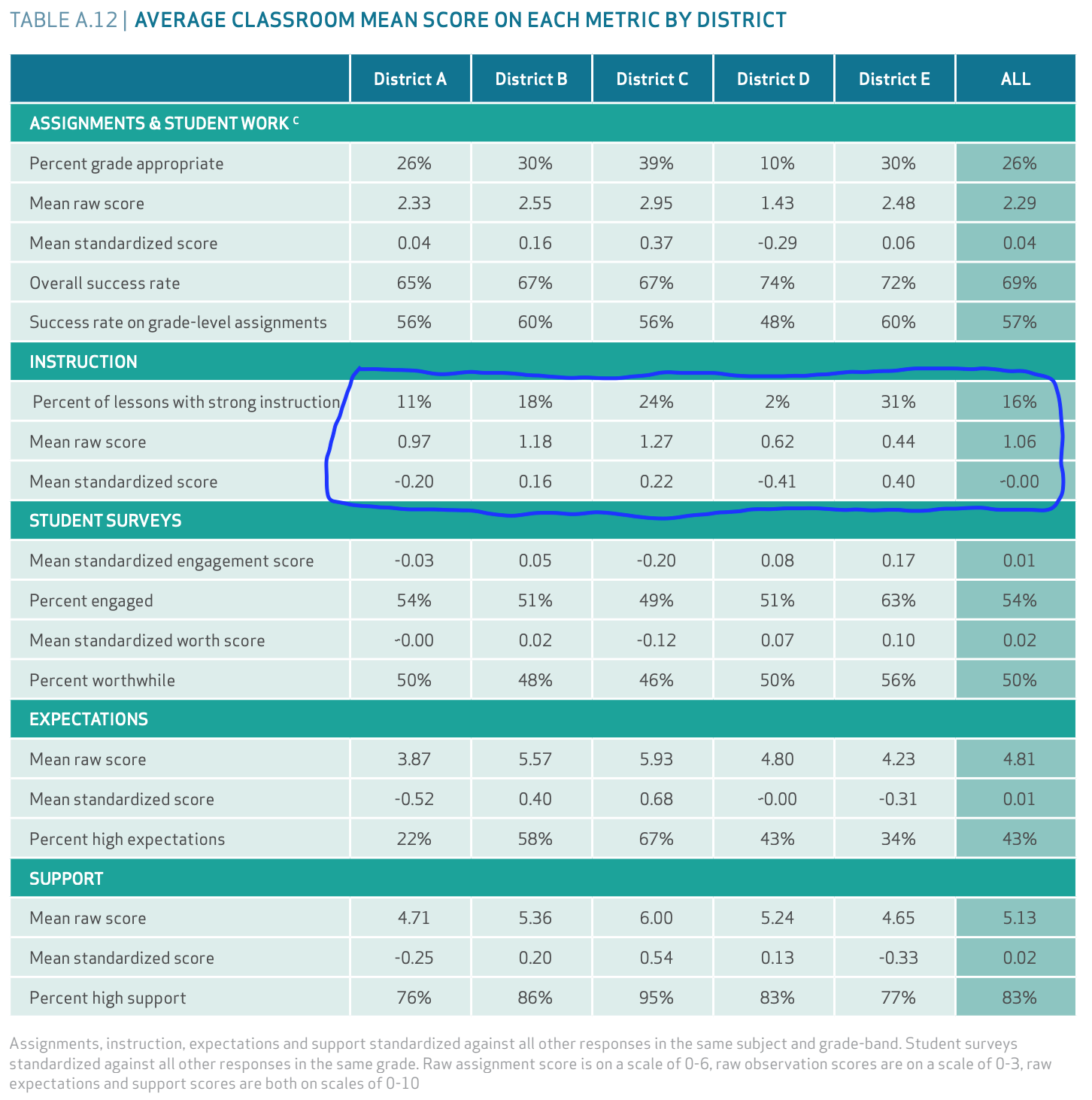
District D was a large (50,000-100,000 students) urban district. Its students in the study were 89% Latino and 7% Black. District E was a small (1,000 - 2,000 students) rural district. Its students in the study were 86% White and 10% Black. 31% of the observed classes in district E were deemed to have strong instruction but only 2% of District D’s had strong instruction. So, district E had much better instruction than district D, right?
Well, let’s look down at the second line: Mean Raw Score. Recall that each observed lesson was rated on a 4-point scale (0-3). A lesson needed to score at least a 2 to be rated as Strong Instruction [page 10]. Notice that district E, which had the highest percentage of classes rated Strong Instruction (31%) has the lowest mean raw score (0.44). It’s even lower than district D (0.62), where only 2% of lessons were rated Strong Instruction. If 31% of district E’s lessons earned at least a 2, it’s mathematically impossible for the remaining 61% to be so bad that the mean score was 0.44. One of the numbers must be wrong.
Now, let’s look at the third line, which shows the Mean Standardized Score. Now district E is back to having the best score (0.40) and district D is back to having the worst score (-0.41). The note at the bottom of the table says that scores were “standardized against all other responses in the same subject and grade-band”. The raw scores and standardized scores are so different because the classrooms observed in districts D and E were very different. 60% of the classrooms observed in district E were K-5 compared to only 14% of district D’s. 42% of district D’s classes were Honors/AP/Dual Enrollment compared to only 14% of district E’s. For the standardization process to have such a strong effect, the average scores must vary enormously by subject and grade-band. Unless someone is willing to make the argument that some subjects and grades always attract better teachers, this suggests to me that the rubric unfairly makes it easier to score highly in certain subjects and grades.
This does raise an important question, which the study does not attempt to answer: when assessing the impact of instructional quality, why not use the average score per lesson instead of the fraction rated “Strong Instruction”? If the instruction rating process has any value, then the average rating should have far more value than the fraction that exceeded an arbitrary threshold.
Back to the graphic at the top of this section: “students spent 29 hours on lessons with strong instruction”. Where did this number come from? They took the average number of lessons with strong instruction (16%), multiplied it by the standard 180-day school year, and assumed that students have daily lessons lasting one hour per subject. 180 * 16% = 28.8 which rounds to 29. Note that the 16% is the average of the classrooms in the study. Tiny (1,000-2,000 students) district E had 74 classrooms in the study while enormous (50,000-100,000 students) district D had 110. District E is thus heavily oversampled in the average. Reporting an average in this way feels like statistical malpractice.
Different Grading Standards
I don’t want to give the impression that I think all the numbers in the report are unreliable. They are not. The chart below comes from page 47 of the TNTP report. It shows what the chances are of a student achieving some standardized test benchmark based on the letter grade they achieve in class. I believe this data is based on all students in the districts, not just those in participating classrooms (see Technical Annex, Table A.11, note c). With such a large dataset, the data should be reliable.

Before we look at the numbers, note the report’s basic assumption is that mastery of rigorous content is well measured by statewide standardized tests, AP tests, and ACT/SAT tests. That assumption would be deemed a highly controversial viewpoint in some circles in San Francisco.
The chart shows that white students who achieve a particular grade have a higher chance of meeting a standardized benchmark (meeting grade-level expectations on statewide tests, or passing an AP test or achieving the college readiness benchmark on ACT/SAT tests) than students of color who achieve the same grade. The report characterizes this as “students of color received grades that less accurately reflected their mastery of rigorous content”. An equivalent framing would be: “students of color receive more generous marks in school than white students with the same level of content mastery.”
In theory, this could mean that students of color are marked more generously than white students when they are in the same class but there is no evidence to support this. The more likely explanation, which is also the report’s explanation, is that students of color are in classes that are systematically less challenging. Even when they do well enough in the class to merit an A, they have learned less than the white students who earned an A in their more challenging classes. They would be better served by being given more challenging material, even if this meant fewer of them received As. This was, for me, the most valuable takeaway from the TNTP report.
I’d even make a more general point: the chart also shows that getting an A in a class is too easy for everyone. If you get an A in middle school math, you should be at least meeting expectations on state tests. What does the “A” mean otherwise? If you get an A in AP English Language but fail to pass the AP exam (which requires getting at least a 3 on a 5-point scale), did your work in class really merit an “A”?
Conclusion
Although I’ve pooh-poohed the actual numbers being cited, I don’t doubt that better instruction, better assignments, more engaged students, and higher teacher expectations are all associated with greater student achievement. How could they not? We should note that a school district has far more control over the first two than the last two. Its new teacher induction and professional development programs could lay out how teachers are expected to conduct their classes and it could regularly assess whether they are doing so. It could enforce use of a standard curriculum to ensure that every class is teaching grade-level material. It could forbid teachers from creating their own assignment material to ensure everything is grade-level. But more engaged students and higher teacher expectations seem more like outputs, not inputs. If you see your students succeeding, you’ll be less likely to agree with statements like “the standards are too challenging for my students.”
The real question is what is better instruction. I’d be very interested to read a flipped study. First, do some huge analysis to rate teacher performance on a value-added basis. Then, do this sort of in-depth study of the practices and beliefs of a range of teachers to see the ways in which high-achieving teachers differ from average teachers and low-achieving teachers. If anyone knows of such a study, please send me a link.
Is 0.25 reasonable? In a normal distribution, 95% of values are within two standard deviations of the mean so, if 0.25 is one year of learning, the distance from two standard deviations below the mean to two standard deviations above the mean is equivalent to 16 full years of learning. Can that be right? Let’s look at the Smarter Balanced scores for California. The standard deviations of the SBAC ELA scores range from 90.6 in 3rd grade to 102.2 in 8th grade. The score required for the 50th percentile increased by an average of 25.4 points per year from 2428 in 3rd grade to 2567 in 8th grade. Depending on which standard deviation you use, you get an estimated annual growth of 0.25 - 0.28 standard deviations. For math, the average annual growth comes out to around 0.21 standard deviations. So, if you’re going to pick a single number, 0.25 is indeed reasonable. How depressing!
Re a flipped study: I think this may be what you’re looking for.
https://usprogram.gatesfoundation.org/news-and-insights/articles/measures-of-effective-teaching-project
I enjoy your email reports and always send them to my daughter (RASOTA grad 2017/UCLA 2021), currently a 7th/8th grade math teacher in Boston PS in her 3rd year of teaching, as a way to stay apprised of what’s happening in her hometown should she decide to teach upon returning home. Sadly, she’d take a 30% pay cut if she came back to teach in SFUSD vs BPS. We clearly don’t have the will to pay teachers here - and SFUSD will likely be missing out on a fantastic teacher.