Okay, this is not strictly related to education but I was looking at the latest census results and couldn’t stop myself.
According to the 2020 census, the population of San Francisco is 39.1% White, 33.7% Asian, 15.6% Hispanic or Latino, and 5.2% Black or African American. 5.2% of people are of two or more races. Which parts of San Francisco come closest to having this population mix? And is the city getting more or less integrated?
Background
San Francisco has a long history of enforced residential segregation, starting with the formation of Chinatown and continuing through the redlining practices that prevented people living in poorer parts of the city from obtaining mortgages to buy their homes. Those legal restrictions have long since been eliminated but different income levels and people’s tendency to live near people similar to themselves mean that the city continues to have areas with distinct racial identities.
The census bureau divides San Francisco up into census tracts for reporting purposes. When they were established, the tracts were designed to contain “populations whose housing and socio-economic characteristics are similar. Because the characteristics of neighborhoods…change with time, census tracts…may become less homogeneous in succeeding censuses.” To maintain comparability over time, census tract boundaries do not change. Population growth may necessitate creating new tracts but this is always done by subdividing existing tracts, not by shifting tract boundaries.
In a perfectly integrated city, each census tract would have the same racial/ethnic mix as the city as a whole. A standard way to measure how integrated a city is is to calculate a divergence index for each tract. The lower the divergence index, the closer the tract is to the city-wide population mix.
Residential Integration in 2020
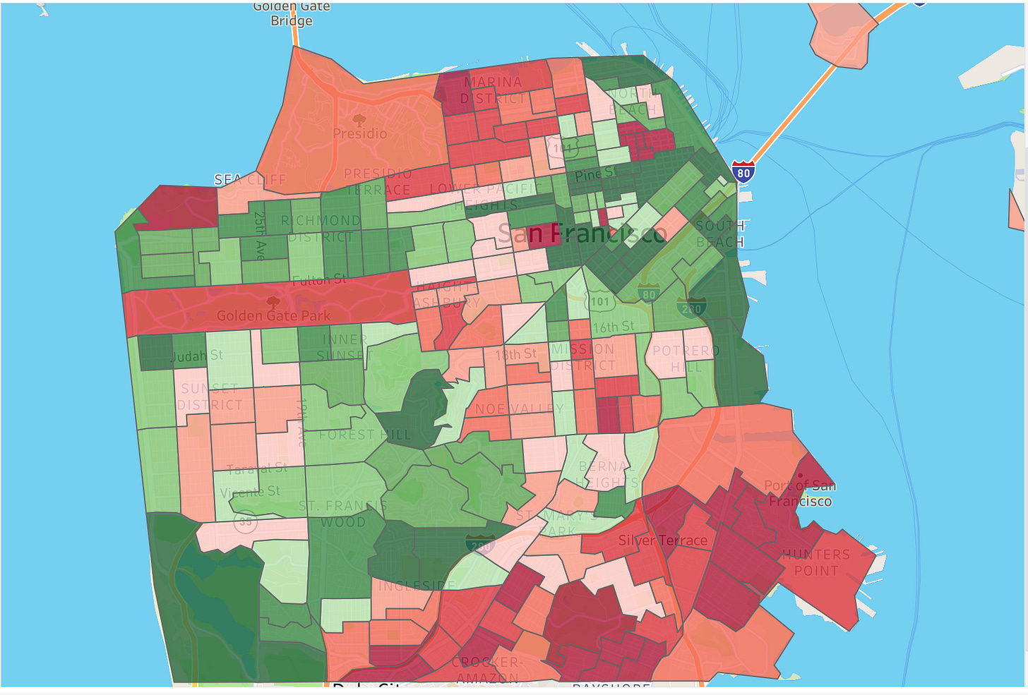
Here’s a map showing how integrated the census tracts were in 2020. The chart below is colored by the decile of the divergence. Green tracts are more integrated than the median; red tracts are less integrated than the median. The 10% of tracts with the lowest divergence index (i.e. the most integrated) are colored dark green; the 10% with the highest divergence index are colored dark red. If you click on the map or here, you can drill down into each tract.
Results
The tract that comes closest to the San Francisco average is Tract 120.02 in the Lower Polk Gulch area between the Tenderloin and Nob Hill. Its population (with the city average in parentheses) is 38% (city average: 39.1%) White, 35.2% (33.7%) Asian, 16.5% (15.6%) Hispanic or Latino, 4.4% (5.2%) Two or more, 4.0% (5.2%) Black or African American, 1.1% (0.7%) Other, 0.6% (0.2%) American Indian and Alaska Native, and 0.2% (0.4%) Pacific Islander. I think that’s pretty close but statistics is unforgiving. There are only 3 chances in a million that a tract with 2,267 people would have that mix if the tract were populated by a truly random sample of San Franciscans1.
City planners will be heartened to know that the second most integrated census tract is tract 607.01 which contains Mission Bay and all its new developments. The majority of the most integrated census tracts can be found in the downtown, South Beach, and SOMA areas.
The tract ranked 3rd is just north of Hayes Valley. It sits right next to the tract in the Western Addition that is ranked 237th out of 241. That these should be neighbors would be surprising to anyone unfamiliar with the city’s housing history.
The highest ranked tract outside those areas, ranked sixth overall, is tract 311 which encompasses the Sunnyside area. It is 42.1% White, 31.0% Asian, 16.7% Hispanic or Latino, 2.7% Black or African American, and 6.4% Two or more. Also making the top decile are the single family homes of Westwood Park (tract 310), the area West of Twin Peaks, the northwest corner of the Sunset and the area west of Lake Merced.
The Richmond shows as a lot more integrated than the Sunset district because the Sunset has many tracts that are at least 50% Asian whereas the Richmond has none.
The tracts covering the expensive single-family homes in St. Francis Wood and Forest Hill are better than the median because they are not identifiably White or Asian.
Many of the tracts in the central spine of the city from the Marina south through Pacific Heights, Cole Valley, and Noe Valley appear in light red because they are 50-75% White.
All bar one of the tracts south of 280 fall below the median. They are joined by the heart of the Sunset (too Asian), Noe Valley (too white), and the Mission (too Latino)
It won’t surprise anyone that a majority of the least integrated tracts can be found in Bayview, Visitacion Valley. The tracts north of 280 that number among the least integrated are five around Chinatown, one in the Mission, one covering Western Addition, one covering the Tenderloin, and one in the Marina.
Most of Pacific Heights, the Marina, and Ashbury Terrace, with their large White majorities, are in the ninth decile. They are joined there by some tracts in the Mission and some of the remaining tracts south of 280 in the Portola and Excelsior districts.
Some observations about group distribution extremes:
Outside of Chinatown, the area with the highest proportion of Asians is not the Sunset but a tract in Visitacion Valley (68.7%) and another in Silver Terrace (66.9%). The area with the lowest proportion of Asians is the Presidio (8.5%).
The area with the lowest proportion of Hispanics or Latinos is not in the Marina or Pacific Heights but tract 331 in the area between Sloat Blvd and Lake Merced where they constitute only 5.5% of the inhabitants. The area outside of the Mission with the most is a tract in the Excelsior where they are 45.1% of the inhabitants.
The tract with the lowest proportion of White people is not in the Bayview but in Visitacion Valley. Tract 264.04 is 50% Asian but only 1.9% White. At the other extreme is the Marina where one tract is 76.1% White.
The tracts with the most from Two or more races are in Noe Valley (9.4%) and on the north slope of Potrero Hill (9.1%).
The tract with the lowest percentage of Black people covers Sea Cliff (0.5%). Outside of Bayview and Western Addition, the only tracts that are more than 20% Black are near the Civic Center and in Bayshore north of the Cow Palace.
It is amazing how concentrated the Pacific Islander population is. Over one-third of all Pacific Islanders can be found in just four of the city’s 240+ census tracts. By comparison, the four census tracts with the largest number of Black inhabitants contain fewer than 15% of all Blacks.
Is San Francisco Getting More Integrated?
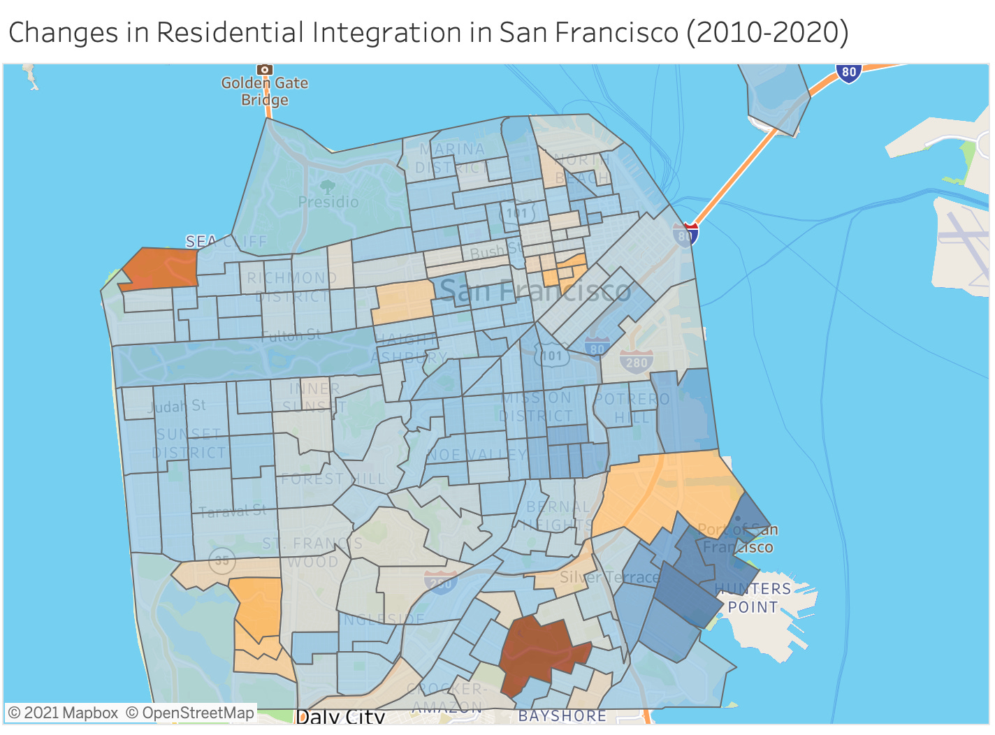
It is clear that San Francisco is far from being a fully integrated city: many parts still have distinct racial/ethnic identities. But is it getting more integrated? Yes. If a tract’s divergence index has gotten smaller between 2010 and 2020, we can say that it got more integrated between 2010 and 2020 because the tract’s population mix more closely reflects the city’s population mix in 2020 than it did in 2010. Of the 195 census tracts2 that existed in 2010, 173 got more integrated and 22 got less integrated. The city’s aggregate divergence index fell from 0.210 to 0.159. You can see how each tract changed here.
Of the tracts that got less integrated (shown in orange above):
Six span the area around the Tenderloin.
Four are between Lake Merced and 19th Ave. Tracts 332.04 and 332.03 ranked 1 and 3 in the entire city in 2010, indicating that they used to reflect the city’s population mix better than anywhere else. They both dropped out of the top 20 because they lost disproportionately more White inhabitants than other parts of the city and gained disproportionately more Hispanics/Latinos. Just to their north is tract 332.01 which lost half of its population, presumably because the students who would have been attending SF State weren’t there because of the pandemic. North of that is tract 331 which dropped because of an entirely different issue: it was majority Asian in 2010 and became even more so in 2020.
Four are south of 280 but don’t form a contiguous block. All slipped because they became disproportionately more Asian (and three were already majority Asian).
Two tracts, one in Russian Hill and one on Nob Hill, bucked the trend and became disproportionately more White and less Asian.
The tracts that are the deepest orange in the above chart are not standard residential tracts. The one near Lands End includes the VA Hospital; the one near McLaren Park has only homeless people. Both have 125 or fewer inhabitants compared with 4000 for the average tract.
Gentrification is good for integration. The tracts whose divergence index improved the most are all in the Bayview and Hunters Point. They still rank in or near the bottom decile but the gap to the rest of the city has closed. The tract whose ranking (as opposed to raw score) in the city improved the most is Tract 226 which covers the Dogpatch area. That tract’s population grew by 226% in the decade and the newcomers were disproportionately Asian and Two or More which brought the proportion of Whites down from 69% to 48%. It was the 93rd most integrated tract out of 195 in 2010. Now it is the 16th. Other tracts to significantly improve their ranking are in the Mission (becoming less Hispanic/Latino) and Lakeview (becoming more Hispanic/Latino).
Further Reading
This analysis uses the same analytic approach as that used by the Othering & Belonging Institute at UC Berkeley in its 2019 analysis of Racial Segregation in the SF Bay Area. I just updated it with the latest census results.
Calculated using a chi-test (not shown here).
The census bureau added nearly fifty new tracts in 2020 in response to the increased population in the city. Since new tracts are always created by subdividing existing tracts, it is easy to break down the 2020 population using the 2010 tracts to analyze changes over time.


