The Achievement Gap in SFUSD
How student achievement in SFUSD compares with other districts in California
How good is San Francisco Unified School District (SFUSD) at its core job of educating students? This is the first of several posts that will dig into this in some detail.
California uses Smarter Balanced Assessments to measure individual student performance in English Language Arts (ELA) and Mathematics as part of its overall California Assessment of Student Performance and Progress (CAASPP) system. If we compare the performance of SFUSD’s students with those in other districts, we can start to understand how good a job SFUSD is doing. We will try to take care when interpreting the results to make sure we compare like with like.
SFUSD itself accepts that these are a good way to measure district performance. For example, in 2018 it boasted: “SFUSD is the only large urban school district in the state, serving more than 50,000 students, in which more than half its students met or exceeded Common Core Standards for both ELA (55.3 percent) and math (50.4 percent)”. The figures are accurate but notice the caveats. There are hundreds of school districts in the state but only twelve with more than 50,000 students. One of those, Capistrano Unified based in San Juan Capistrano in Orange County, also surpassed the fifty percent threshold in both subjects (and by much more than SFUSD), but I guess it didn’t qualify as “urban”. Of the remaining ten, SFUSD has by far the lowest percentage of Latino and the highest largest percentage of Asian students.
The Achievement Gap
You can’t read anything about education without hearing about the “achievement gap” between students from different races/ethnicities. Most people are at least dimly aware that, on average, Asian students do better than White students who do better than Latino students who do better than Black students.
But this is not some iron-clad law of nature. The size of the gap varies enormously from district to district and there are entire districts where White students do better than Asian students or where Black students do better than Latino ones.
There are multiple ways to measure performance. Let’s consider for now the percentage of students who score Standard Met or Above Standard on the relevant SBAC test. The tests were canceled because of the pandemic so the most recent results we have are from 2018-19.
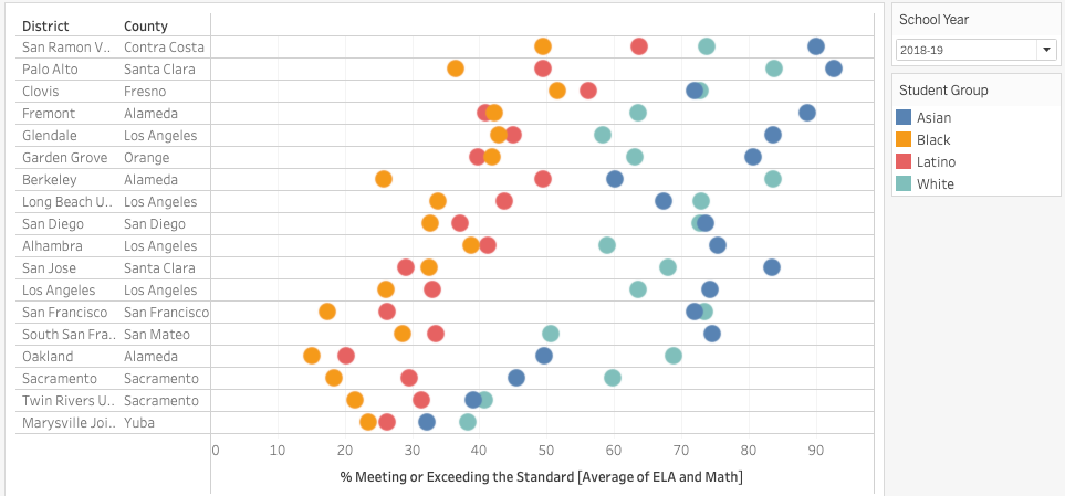
Here’s the performance of Asian, Black, Latino, and White students varies in selected school districts across the state. Some of the districts are in the Bay Area and will be well known to readers. Others are included because they illustrate the range of possible scores.
San Ramon Valley and Palo Alto are both in wealthy areas (10% or fewer children are eligible for free or reduced price meals) and have relatively few Latino and Black students. The achievement gap is much greater in Palo Alto than in San Ramon Valley.
Clovis Unified in Fresno is 38% Latino and 44% economically disadvantaged (i.e. 44% of students are eligible for free or reduced-price meals, FRPM eligible in the jargon) but all its student groups perform well and the achievement gap is comparatively small.
Glendale, Alhambra, and Garden Grove are examples of districts that are more economically disadvantaged (52%, 62%, and 69%) than San Francisco (51%) but whose students obtain better results on average and with a smaller performance gap.
Long Beach is included because SFUSD uses it internally as a comparable district.
At the other extreme, Marysville Joint Unified in Yuba and Twin Rivers Unified in Sacramento are very equitable but in a bad way: no group does well there.
Balanced Achievement
Instead of looking at an artificially selected set of districts, let’s look at all school districts with at least 5,000 students. In which districts do students perform well and in which is the level of performance less dependent on race or ethnicity? The ideal, obviously, is that every group does well.
To measure the average achievement level, we’ll use the simple (unweighted) average of the percentage of Asian, Black, Latino, and White students that meet or exceed standards. This is preferable to the published district average because a district that is heavily Asian or White would have an advantage over a district that is heavily Latino or Black even if the achievement levels of the four groups were the same in both districts. Consider two hypothetical school districts. One is 70% Asian and 30% Latino, the other is 30% Asian and 70% Latino. In both districts, 75% of Asian students and 40% of Latino students meet or exceed the standards1. The first district will be able to boast that 65% (0.7 * 0.75 + 0.3 * 0.4) of its students meet or exceed the standards while only 51% (0.3 * 0.75 + 0.7 * 0.4) of the second district’s students meet or exceed the standards. The first district isn’t really any better at education. It just benefits from more favorable demographics.
We are looking for a high average achievement level combined with a small a gap as possible between the highest and lowest achieving group.
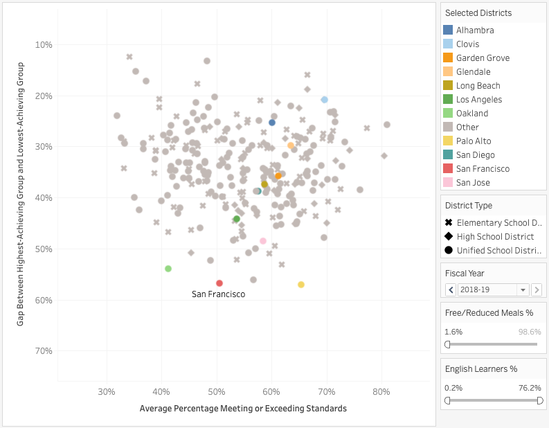
The horizontal axis shows the average achievement level. The vertical axis shows the achievement gap i.e. the difference between the percentage from the highest-achieving group (usually, but not always, Asian) that met or exceeded the standard and the percentage from the lowest-achieving group (usually, but not always, Black) that met or exceeded the standard. This axis is reversed so that the best districts (i.e. those with the highest average score and the smallest gap) can be found in the top-right quadrant.
SFUSD is the red dot in the center bottom. The average achievement level is around 50% but the achievement gap, at 57%, is higher than in every other district except Palo Alto. It is notable that the five districts with the highest gaps (Palo Alto, San Francisco, Berkeley, Oakland, Redwood City Elementary) can all be found in the Bay Area.
The large district that does best in this view is Clovis Unified in Fresno. Several smaller districts in Los Angeles and Orange counties also manage to get excellent results for their Black and Latino students. For example, Bonita Unified in LA is 53% Latino and is not particularly rich (38% of kids are eligible for free- and reduced-price meals) but 66% of those Latinos meet or exceed ELA standards.
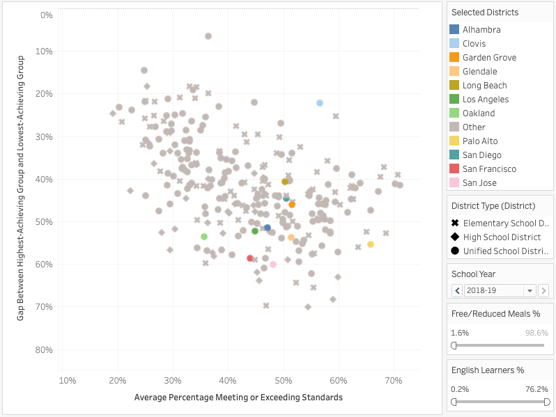
The picture for Math is similar but not identical. SFUSD doesn’t stand out as much even though the Math achievement gap in SFUSD is greater than the ELA achievement gap in SFUSD because other districts do comparatively worse. On the other hand, Clovis’s excellence is even more evident.
Groups in Isolation
The achievement gap is real and is worse in SFUSD than in most other districts. But is the problem with the achievement level or the gap? Let’s look at each of the major racial/ethnic groups in isolation. How well do these groups do at at SFUSD in comparison with other districts?
White Students
In this figure, the horizontal axis is the percentage of students in a district who are White and the size of the disc corresponds to the actual number of White students in the district. SFUSD is shown in red. White students actually do comparatively well in SFUSD. In only a few districts, such as Berkeley and Palo Alto, do a greater percentage of White students meet or exceed California standards.
Asian Students
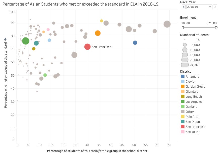
Now let’s look at Asian students. The size of the red disc is bigger here because only Los Angeles and Fremont have more Asian students than SFUSD. Asian students do worse in SFUSD than in all of the districts with a higher percentage of Asians and in many of the districts with a lower percentage of Asians.
Hispanic or Latino Students
Here’s the same chart for Latino students. Even though Latino students form a majority in many school districts, the discs are much smaller in this figure because Los Angeles Unified has so many Latino students that all other districts, including SFUSD, look tiny by comparison. SFUSD has a smaller proportion of Latino students (31%) than most districts but Latino students do worse in SFUSD than in all of the districts with a smaller percentage of Latinos and in most of those with a higher percentage of Latinos.
African American or Black Students
Here’s the same chart for Black students. There is an obvious trend where Black students tend to do better in districts where they are a smaller percentage of the student body. Some of the high-achieving districts (like Clovis where 58% of Black students meet or exceed ELA standards) are barely visible because the actual number of Black students is comparatively small (1363 in Clovis’s case). But Corona-Norco Unified in Riverside is 5.9% Black and has over 3,000 Black students and 55% of them meet or exceed ELA standards (compared with 21% of San Francisco’s 4,900). Big districts like Los Angeles Unified, Long Beach, and San Diego all have more Black students in both absolute terms and as a percentage of the student body and yet get much better results than San Francisco. Even Inglewood Unified in Los Angeles, which is 40% Black and 86% Free or Reduced-Price Lunch does better than SFUSD. In fact, in only seven districts do Black students do worse than they do in SFUSD. Curiously, four of those seven are in either Alameda or Contra Costa.
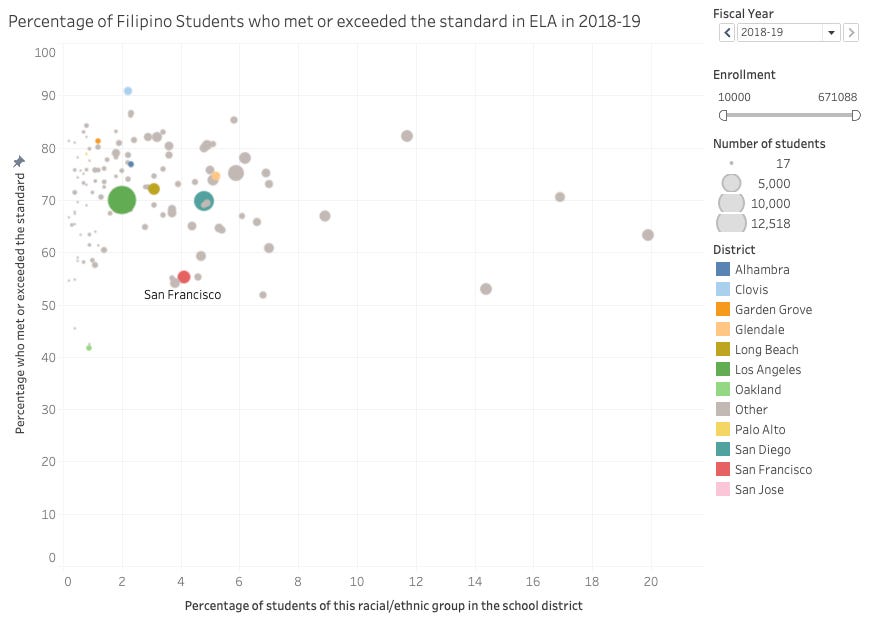
Filipino Students
SFUSD’s underperformance is perhaps even bleaker when we consider Filipino students. Only three districts that are at least 1% Filipino have a lower percentage of Filipinos meeting or exceeding state standards.
Commentary and Next Steps
The achievement gap is real and is worse in SFUSD than in most other districts. But the issue is better framed not as “why do Latino students not do as well as Asian students” but as “why do Latino students in SFUSD do worse than Latino students in other California districts” because that is the heart of the issue.
In the next post, we’ll explore some of the factors that drive student achievement whether related to the student (e.g. English language learner status), the family (e.g. family income level, parental education) or the district (e.g. student-teacher ratio) and see to what extent these can explain what we see in San Francisco.
In the meantime, you can explore and drill in to all the figures shown in this post here.
These are pretty close to the actual state averages.





Heartbreaking but vital data and analysis. Thank you