Who gets placed in Special Education?
Why are Latino and Black students more likely to be in special education in low poverty districts?
Introduction
The CDE recently published data on special education for the first time since before the pandemic. The data gives a breakdown of the number of students who are in special education in every school and provides a breakdown for every district by disability and demographic factors. Conspicuously missing from the data is any attempt to place this in context by comparing it with the number of students enrolled. Does the rate at which students are placed in special education vary from district to district or by demographic factors? Is there anything we can learn that might limit the strain that special education puts on the education budget?1
Primer on Special Education Jargon
If you’re as clueless as I was about special education before embarking on this project, a quick primer might be in order.
According to California law, each child with a disability is entitled to a free and appropriate public education (FAPE) that provides the student’s Individualized Education Program (IEP) in the Least Restrictive Environment (LRE) i.e. in the same class as the student’s non-disabled peers to the extent possible.
Identifying, assessing, and educating students with disabilities is a complex task that might be beyond the skills of smaller districts. All school districts and county education offices are therefore part of a Special Education Local Plan Area (SELPA) that provides special education services to the districts in its area. San Francisco, San Mateo, and Marin each have one SELPA for the entire county. Santa Clara is divided among six SELPAs. In Alameda, Oakland Unified is its own SELPA and three other SELPAs cover the rest of the county. In Contra Costa, three districts are their own SELPAs and there is one other SELPA for the rest of the county.
Since some disabilities might necessitate particularly specialized education, it is not uncommon for a student to receive special education services from a different school or district than the one the student regularly attends or would attend in the absence of the disability. The CDE’s reporting distinguishes between the district a student attends and the District of Special Education Accountability (DSEA), which defaults to the district of geographic residence.
For example, some deaf students may be referred by their home districts to attend the California School for the Deaf in Fremont. Even though the students attend the School for the Deaf, their home districts remain the DSEAs for them. Thus, Fremont Unified enrolls 13 Deaf/Hearing Impairment students but it is the DSEA for 46; Oakland Unified enrolls 13 but is the DSEA for 33; San Francisco Unified enrolls 24 but is the DSEA for 34. In total, the California School for the Deaf in Fremont has 265 students with the disability “Deaf/Hearing Impairment” but it is the DSEA for fewer than ten (and perhaps zero) of them.
Exactly which district is responsible for a student can be complicated. Here are some of the scenarios that CDE envisages for K-12 students:
Student is a K-12 student whose District of Geographic Residence (District A) refers the student through the IEP process to District B, and District B provides instruction and services to the student.
Student is a K-12 student who transfers from their district of geographic residence, District A, on an Interdistrict Transfer (pursuant to Education Code 63600) to another LEA (District B).
Student is a K-12 student who lives and attends school in District A which is providing the majority of instructional services, and the COE is providing special education services only.
Student is a K-12 student who is attending a private school located within the geographic boundaries of the school district in which they live and is receiving services through an Individualized Service Plan (ISP) from District A.
Student is a K-12 student who is attending a private school that is not located within the geographic boundaries of the school district in which they live and is receiving services through an ISP from District B.
Student is a K-12 student who attends and receives all instruction and services from a charter that is a charter LEA for special education purposes.
Student is a K-12 student whose district of geographic residence is District A, attends a charter school that is not a charter LEA for special education purposes, and receives special education services only from the authorizing district (District A).
Student is a K-12 student who attends a charter school that is not a charter LEA for special education purposes, and receives special education services from the charter school.
Charter schools have a choice. They can function as “schools of the district”, where the authorizing school district provides the special education services (and gets the associated funding), or they can take on the service delivery responsibility themselves which gives them more autonomy in funding and oversight. Across the state, 53% of charter school special education students are in schools that provide their own SpEd services and the remaining 47% are in schools that pass that responsibility to the authorizing school district. The proportion is different in San Francisco:
the two Gateway schools function as “schools of the district” for special education purposes i.e. SFUSD is the DSEA.
The KIPP schools, Mission Prep, Edison, New School, and City Arts are the DSEAs for their own students.
Creative Arts manages the creative solution of being the DSEA for 3 of its 54 Special Education students.
County Offices of Education are often not the DSEAs for the special education students they enroll. In other words, they have more special education students enrolled than the number for which they are the DSEA. Conversely, individual school districts usually have more students for whom they are the DSEA than they have enrolled special education students. More inexplicably, COEs often report more special education students than they have enrolled students. I’m sure there’s some logical explanation for this but I don’t know what it is.
These scenarios complicate reporting. A district that appears to have few SpEd students enrolled may be the DSEA for others who are attending schools outside the district. Even at the county level, the numbers don’t match. Alameda County enrolls 211 more SpEd students than it is the DSEA for. Contra Costa enrolls 36 fewer, San Francisco 27 fewer, Santa Clara 15 fewer.
Special Education By The Numbers
Okay, primer over. Let’s look at the basic numbers. 793,985 students were enrolled in special education in 2022-23. That’s 13.6% of all public school students.
Disability Types
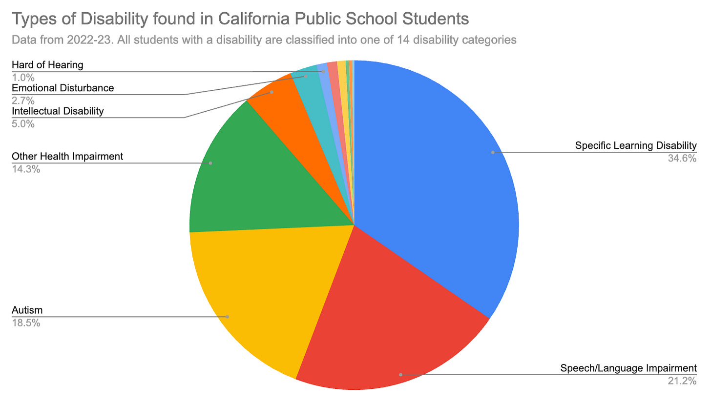
To be in special education, a student must have a diagnosed disability, of which there are fourteen categories. As figure 1 shows, three of those fourteen (Specific Learning Disability, Speech / Language Impairment, and Autism) account for nearly three-quarters of all students receiving special education.
Gender Mix
There is a huge split by gender. As figure 2 shows, Boys are 89%2 more likely than girls to be in Special Education. Incidentally, non-binary students are basically like boys: they are 81% more likely than girls to be in Special Education.
Grade Mix
I was very surprised to see that the incidence is remarkably flat across grades. 13.5% of students in grades preschool-3 are in special education, as are 13.8% of those in grades 4-6, 13.6% of those in grades 7-8, and 13.5% in grades 9-12. I had expected the numbers to rise more precipitously up to middle school as I regularly read stories about children being diagnosed late. Given the flat distribution across grades, it appears that most kids are diagnosed before the end of third grade. An alternative explanation that would also fit the data is that there are a large number of late diagnoses but there are also an offsetting number of students exiting SpEd. No data was provided on how often students exit SpEd so it’s unclear which explanation is correct.
School Type
Across the state, 11.8% of students in charter schools receive special education, compared with 13.8% of students in district schools. At first glance, this is ammunition for opponents of charter schools who frequently complain that charters try to get out of serving students with disabilities.
The story is more nuanced if we compare the school types by grade span. If charter schools tried to force special education students out, as opponents sometimes claim, we would see the share of special education students in charter schools go down in higher grades. In fact, figure 3 shows the opposite.
Charter schools serving middle and high school grades have a higher percentage of special education students than charter schools serving elementary grades (but still below the percentage in district schools). In grades preschool-3, the gap between charters and district schools is five percentage points (14.0% for district schools; 9.0% for charters), but by middle school and high school, the gap has shrunk to 0.6%.
Race/Ethnicity
As with so many other things in education, the rate at which students receive Special Education varies by race/ethnicity. Figure 4 shows that 7.1% of Asian students are in special education, compared to 13.3% of White students, 14.5% of Latino students, and 19% of Black students.
English Learner Status
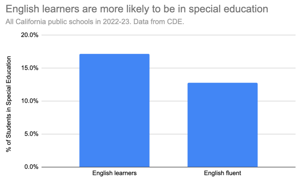
My first thought was that English learner status should make no difference to whether a child is in special education. Special Education is intended for students with disabilities. Speaking Spanish at home is not a disability. Nevertheless, as figure 5 shows, 17.1% of English Learners are in Special Education, compared with 12.7% of those fluent in English.
This is not a consequence of the racial/ethnic differences outlined above. The CDE does not break the data down by the combination of ethnicity and language status but we can simulate it by focusing on districts that are overwhelmingly Latino so that the English learners and the English fluent are both Latino. I identified 13 districts that have at least 10,000 students who are at least 80% Latino. An unweighted average of those 13 districts shows that 16% of English learners but only 11.6% of English-fluent students were in special education. It is worth noting that the range was huge. In Santa Ana Unified (40,000 students who are 96% Latino), English learners are 9.8 percentage points more likely to be in Special Education. But in San Bernardino City (46,000 students who are 82% Latino), English learners are 1.6 percentage points less likely to be in Special Education.
I came up with the following explanation for why English learners are more likely to be in special education. Imagine two pools of Latino students, one containing English learners and the other English fluent students. In kindergarten, each pool has the same number of students with disabilities. A student with a disability might be unable, or might take longer, to learn English. Over time, as they learn English, the students without disabilities will shift over to the English fluent pool, leaving behind a higher and higher concentration of students with disabilities in the English learner pool. Since the statistics average across grades, this would explain why special education rates are higher among English learners.
Recall that 14.5% of all Latino students and 13.3% of all White students are in Special Education. Since Latino students are far more likely than White students to be English learners, and the gap between the Special Education rates of English learners and English fluent students is so big, it’s probable that English-fluent Latino students are less likely to be in Special Education than English-fluent White students.
Geographic Incidence
Given the incidence rates by race, you might expect that the geographic areas with the lowest incidence rates would be those with the most Asian students and that the areas with the highest incidence rates would be those with the most Black students. You would be wrong.
The counties with the highest incidence are in two geographic groups. Alpine, Amador, and Calaveras counties, which are neighbors in the Sierras, all have incidences over 18%. Humboldt and Del Norte counties, which are neighbors on the coast south of Oregon, are both between 17% and 18%. These counties are all small (Humboldt, with fewer than 18,000 students, still has more than the other four counties combined) and have majority White populations.
The counties with the lowest incidence are grouped together in the Central Valley: Fresno, Tulare, Kings, Madera, and Kern all have incidences between 10.4% and 11.8%.
By comparison, San Francisco, at 13.3%, is just below the state average. Other Bay Area counties range from Santa Clara (11.9%) to Contra Costa (13.5%).
District Poverty
I thought it would be interesting to investigate if special education rates varied according to the district poverty level. I found that they did but in a surprising way.
White and Asian students were more likely to be in special education in high poverty districts.
Latino and Black students were more likely to be in special education in low poverty districts.
This was perplexing. If high poverty caused, in some way, higher rates of disability, then every demographic group would see higher special education rates in high poverty districts. On the other hand, if, for example, low poverty districts systematically did a much better job of identifying disabilities than high poverty districts, then every demographic group would see higher special education rates in low poverty districts. How to explain the conflicting trends?
Low poverty districts tend to have more White and Asian students and high poverty districts tend to have more Latino and Black students. I calculated the percentage of “Black and Brown” students in a district i.e. the percentage of students who are Black, Latino, Pacific Islander or American Indian. This turned out to be an even better predictor of how often kids were placed in special education.
Figure 6 shows the data3 for Latino students, who are more likely to be in special education in districts with few Black and Brown kids. I’m amazed that one simple variable that should have nothing to do with incidence of childhood disability, namely the percentage of Black and Brown kids in a district, explained 36.8% of the variability in special education rates among Latino students.4

The next strongest relationship was for Asian students, but the relationship is in the opposite direction. As figure 7 shows, Asian students are more likely to be in special education in districts with higher percentages of Black and Brown students.

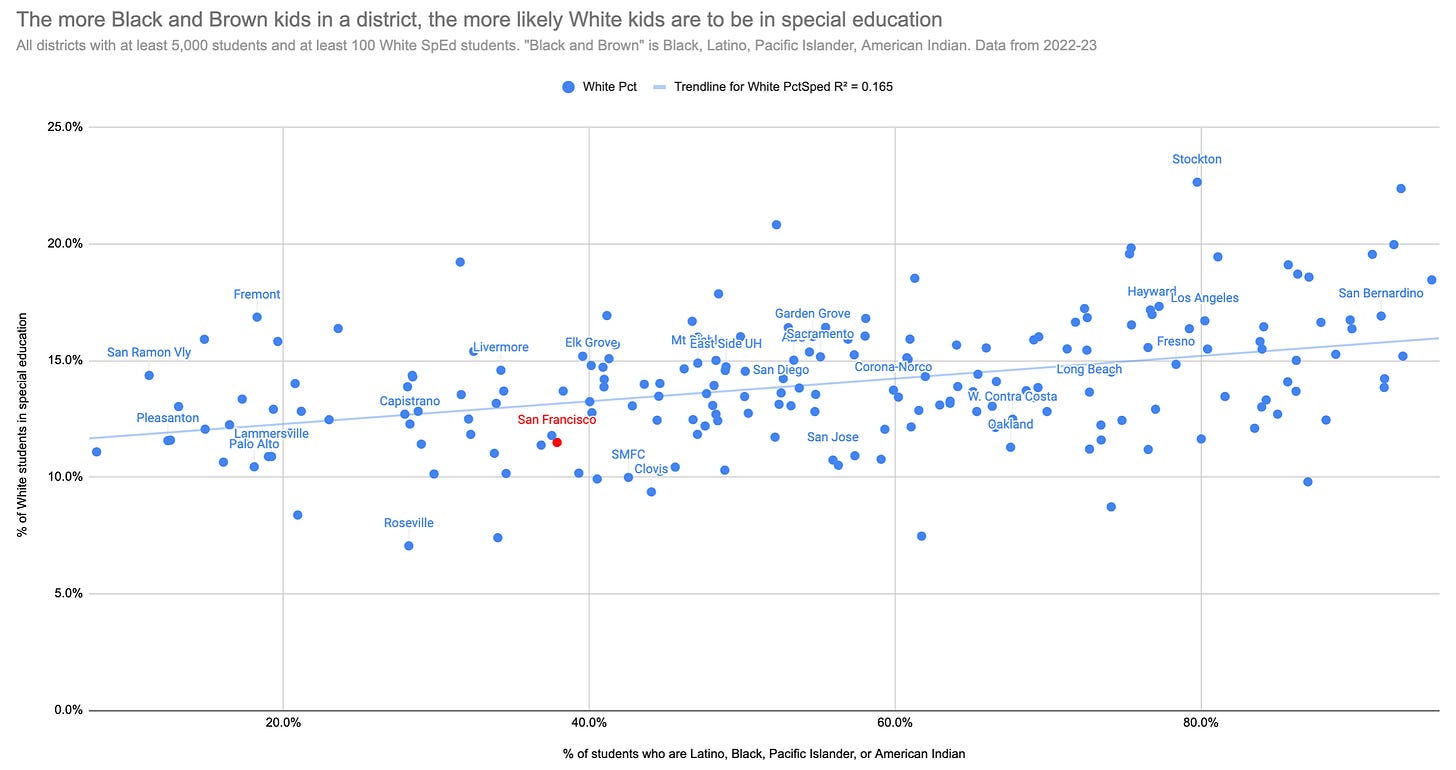
White students, like Asian students, are more likely to be in special education in districts with high percentages of Black and Brown students but, as figure 8 shows, the R-squared is a bit lower than it is for Asian students.

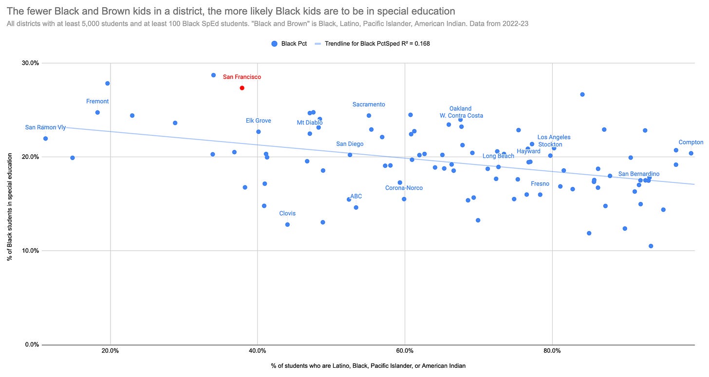
The direction of the relationship flips again for Black students. As figure 9 shows, they are more likely to be in special education in districts with few Black and Brown students but the relationship is not as strong as it is for Latino students.

Here is my interpretation of the data.
Within a district, students are assessed not according to objective textbook definitions of a disability but relative to other students in the district. Low poverty school districts are filled with the children of prosperous, highly educated, White and Asian parents and they far surpass state achievement averages. Latino students in those districts do much better than Latino students in high poverty districts but they are still a long way behind their White and Asian peers. This achievement gap is very visible in the low poverty districts and one response is to assign many of the low achieving kids to special education in a bid to boost their achievement. The achievement gap is neither as great nor as visible in high poverty districts partly because there are fewer White and Asian students in those districts and partly because those that are there don’t do as well (more of them are themselves socioeconomically disadvantaged). When a district is 70% or 80% or 90% Latino, the performance of Latino students becomes the norm. If some students happen to do much better than the norm, that’s a good thing. When a district is 5% or 10% Latino, the high performing White and Asian students define the norm and the comparative underperformance of the Latino students becomes an actionable issue and the action taken is to assign them to special education.
It is also clear that, even after considering the demographic issue, disability standards are not the same from district to district. A student with a particular set of issues might get placed in special education in one district but not in another district with exactly the same demographic composition. Some districts just have a greater propensity to place kids of all races in special education than others. Figure 6 above showed that the percentage of Black and Brown kids in a district predicted 37% of the observed variability in Latino special education rates. I could get the R-squared up to 48% by adding a second independent variable: the percentage of White kids5 in special education in each district. This latter acts as a proxy for a district’s propensity to place kids of all races in special education. It’s notable that, once we control for the Black and Brown percentage in a district, the special education rate of Latino students goes up when the special education rate of White students goes up. This is what we would naively expect but it’s the opposite of what we see if we fail to control for the Black and Brown percentage.
If anyone has suggestions for an alternative explanation that might fit the data, please let me know. I’ll be happy to run the numbers.
Next
The CDE data also includes figures for the percentage of time students with disabilities spend in regular class settings. In the next post, I’ll drill in to that data and see if it reveals anything interesting.
This post will not examine how special education enrollment has changed over time because CDE deleted all the old data when they published the 2022-23 data. It’s possible they did this because the data is is now structured differently, making direct comparisons problematic. Why they couldn’t have retained the old data is unclear.
17.6% of boys, but only 9.3% of girls, are classified with a disability and the ratio of these two gives the 89% number. The raw CDE numbers show that there are 100% more boys than girls in special education but this doesn’t adjust for the fact that there are more boys than girls in the general population.
In this chart, and the succeeding ones, I’m using the district of enrollment rather than the district of special education accountability, and restricting the data to district schools only rather than including charter schools. I also wanted to look at the same analysis by DSEA but this gets tricky because we don’t know total enrollment by DSEA, only by district of attendance. This is not a big issue in regular districts but it is when there are districts with a lot of charter schools that don’t provide their own special education services.
The district poverty rate is not as good a predictor as the Black and Brown percentage. In the Latino students, it predicts 30%, not 36.8% of the variability in special education rates. If I regress on both the the district poverty rate and the Black and Brown percentage, the R-squared barely moves, from 0.368 to 0.369. In other words, the district poverty rate adds nothing that is not already captured by the Black and Brown percentage. In statistical terms it’s collinear.
Yes, it would probably be better to calculate the special education rate of all non-Latino students, not just White students, but I got lazy.


